
こんにちは、mabuiです。
今回は以前サンプルを作った時にも使用した、
Reactで作ったサンプルにMaterial-UIを適用する
Material-UIを使って、検索バーの実装を紹介します。
Material-UIの公式リファレンスではコンポーネントのサンプルがいくつも紹介されていて、その中のapp barをベースにした実装をしていきます。
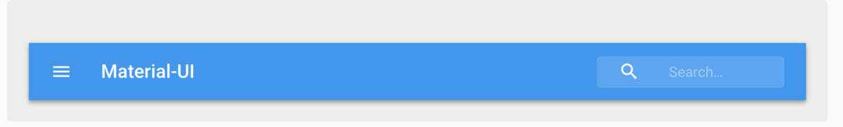
扱うものはこういった形のサーチバーで、カーソルを合わせると伸縮するアクションをします。
ソースコード
まずはコンポーネントのソースコードです。
|
1 2 3 4 5 6 7 8 9 10 11 12 13 14 15 16 17 18 19 20 21 22 23 24 25 26 27 28 29 30 31 32 33 34 35 36 37 38 39 40 |
import React from 'react'; import PropTypes from 'prop-types'; import { withStyles } from '@material-ui/core/styles'; import AppBar from '@material-ui/core/AppBar'; import Toolbar from '@material-ui/core/Toolbar'; import Typography from '@material-ui/core/Typography'; import Search from "./search"; import Button from "@material-ui/core/Button/Button"; const styles = { root: { flexGrow: 1, }, flex: { flexGrow: 1, }, }; function TitleAppBar(props) { const { classes, title, search } = props; return ( <div className={classes.root}> <AppBar position="static"> <Toolbar> <Typography variant="title" color="inherit" className={classes.flex}> {title} </Typography> <Search search={search} /> </Toolbar> </AppBar> </div> ); } TitleAppBar.propTypes = { classes: PropTypes.object.isRequired, }; export default withStyles(styles)(TitleAppBar); |
タイトルはコンポーネントを呼び出す時に<TitleAppBar title=‘Material-UI’ />
こういった形で変更できるようにしています。
呼び出し時に指定した変数はコンポーネント内にpropsとして渡ります。
const { classes, title, search } = props;
この部分でpropsから値を取り出して使用しています。
<Search search={search} />
サーチバー自体のコンポーネントはこの一行で呼び出している<Search/>です。
引数に渡しているsearchはActionsのメソッドで後ほど解説します。
searchのactionをpropsに渡しているのはcontainerで、下記の記事で解説しています。
Reactのみで実装したサンプルに、Reduxを導入する
次はサーチバーのコンポーネントについて見ていきます。
|
1 2 3 4 5 6 7 8 9 10 11 12 13 14 15 16 17 18 19 20 21 22 23 24 25 26 27 28 29 30 31 32 33 34 35 36 37 38 39 40 41 42 43 44 45 46 47 48 49 50 51 52 53 54 55 56 57 58 59 60 61 62 63 64 65 66 67 68 69 70 71 72 73 74 75 76 77 78 79 80 81 82 83 84 85 86 87 |
import React from "react"; import PropTypes from "prop-types"; import { withStyles } from '@material-ui/core/styles'; import { fade } from '@material-ui/core/styles/colorManipulator'; import Input from '@material-ui/core/Input'; import SearchIcon from '@material-ui/icons/Search'; const styles = theme => ({ root: { }, textField: { marginLeft: theme.spacing.unit, marginRight: theme.spacing.unit, width: 200, }, search: { position: 'relative', borderRadius: theme.shape.borderRadius, backgroundColor: fade(theme.palette.common.white, 0.15), '&:hover': { backgroundColor: fade(theme.palette.common.white, 0.25), }, marginLeft: 0, width: '100%', [theme.breakpoints.up('sm')]: { marginLeft: theme.spacing.unit, width: 'auto', }, }, searchIcon: { width: theme.spacing.unit * 9, height: '100%', position: 'absolute', pointerEvents: 'none', display: 'flex', alignItems: 'center', justifyContent: 'center', }, inputRoot: { color: 'inherit', width: '100%', }, inputInput: { paddingTop: theme.spacing.unit, paddingRight: theme.spacing.unit, paddingBottom: theme.spacing.unit, paddingLeft: theme.spacing.unit * 10, transition: theme.transitions.create('width'), width: '100%', [theme.breakpoints.up('sm')]: { width: 120, '&:focus': { width: 200, }, }, }, }); function Search(props) { const { classes, search } = props; return ( <div className={classes.root}> <div className={classes.search}> <div className={classes.searchIcon}> <SearchIcon /> </div> <Input placeholder="Search…" disableUnderline classes={{ root: classes.inputRoot, input: classes.inputInput, }} onChange={(event) => search(event.target.value)} /> </div> </div> ) } Search.propTypes = { classes: PropTypes.object.isRequired, }; export default withStyles(styles)(Search); |
functionとstyles共にほぼ下記のリファレンス通りですが、
App Bar React component - Material-UI
<Input/>コンポーネントのonChangeプロパティを使用してsearchアクションに値を渡すところを追加しました。
onChangeを使用することで、検索バー内の値が変更時にevent.target.valueを参照することでリアルタイムに値を受け取れます。
inputコンポーネントのapiリファレンスはこちら
最後にsearchアクションです。
|
1 2 3 4 5 6 7 8 9 10 11 12 13 14 15 16 17 18 |
const data = [{name: 'hoge'}, {name: 'fuga'}, {name: 'bar'}] const Actions = { search(searchKey) { const searchData = data.filter((data) => { return data.name.startsWith(searchKey) }) return { type: 'SEARCH', resultData: searchData } } } export default Actions |
今回はシンプルにnameで前方一致検索を実行しています。
returnでreducersに値を返してstoreを更新し、表示側でresultDataを参照すればリアルタイム検索の完成です。