
こんにちは、mabuiです。
Reactで作っている仮想通貨の情報を表示するサンプルにルーティングを導入して、
通貨ごとの個別ページに何を表示しようか考えたところ、
チャートを表示することにしました。
今回はその時に使用したPlotly.jsでのチャート実装方法を紹介します。
動作イメージ
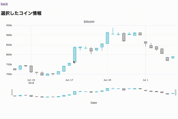
30日分の日足を描画した、シンプルなチャートです。
各足の情報が見れるのと、好きな範囲で期間を狭めたりもできます。
Plotly.jsとは

Plotly.js
おしゃれなグラフを表示できるJavaScriptのライブラリです。
グラフ描画のライブラリは複数ありますが、
インタラクティブ性が高いチャートグラフを表示したかったのと、
以前Python版のPlotly.pyを使用していたのでこちらを使用することにしました。
actionクラスにチャート描画のロジック作成
actions/detail.js
|
1 2 3 4 5 6 7 8 9 10 11 12 13 14 15 16 17 18 19 20 21 22 23 24 25 26 27 28 29 30 31 32 33 34 35 36 37 38 39 40 41 42 43 44 45 46 47 48 49 50 51 52 53 54 55 56 57 58 59 60 61 62 63 64 65 66 67 68 69 70 71 72 73 74 75 76 77 78 79 80 81 82 83 84 85 86 87 88 89 90 91 92 93 94 95 96 97 98 99 100 101 102 103 104 105 106 107 108 109 110 111 112 113 114 115 116 117 118 119 120 121 |
import Plotly from "plotly.js-dist"; function groupBy(list, keyGetter) { const map = new Map(); list.forEach((item) => { const key = keyGetter(item); const collection = map.get(key); if (!collection) { map.set(key, [item]); } else { collection.push(item); } }); return map; } function getData(x, open, close, high, low) { const trace1 = { x: x, close: close, decreasing: { line: { color: '#7F7F7F' } }, high: high, increasing: { line: { color: '#17BECF' } }, line: { color: 'rgba(31,119,180,1)' }, low: low, open: open, type: 'candlestick', xaxis: 'x', yaxis: 'y' }; return [trace1]; } function getLayout(id, x, low, high) { const layout = { title: id, dragmode: 'zoom', margin: { r: 10, t: 25, b: 40, l: 60 }, showlegend: false, xaxis: { autorange: true, domain: [0, 1], range: [x[0], x[x.length - 1]], rangeslider: { range: [x[0], x[x.length - 1]] }, title: 'Date', type: 'date' }, yaxis: { autorange: true, domain: [0, 1], range: [Math.min(...low), Math.max(...high)], type: 'linear' } }; return layout; } const Actions = { plot(id) { return function (dispatch) { // 換算する通貨 const vsCurrency = 'jpy'; // チャート取得日数 const days = 30; // coingeckoのapiから対象銘柄(id)のチャート情報取得 const endpoint = "https://api.coingecko.com/api/v3/coins/" + id + "/market_chart?vs_currency=" + vsCurrency + "&days=" + days; const list = []; const x = []; const open = []; const close = []; const high = []; const low = []; fetch(endpoint).then((response) => { const json = response.json(); json.then((value) => { const prices = value.prices; // const marketCaps = value.market_caps; // const totalVolumes = value.total_volumes; for (const key in prices) { const price = prices[key]; const datetime = new Date(price[0]); const ymd = datetime.getFullYear() + '-' + datetime.getMonth() + '-' + datetime.getDate() list.push({'date': ymd, 'price': price[1]}); } }); }).then(() => { setTimeout(() => { // 日付でグルーピングして、日足情報に変換 const grouped = groupBy(list, price => price.date); for (const entity of grouped) { const list = []; for (const price of entity[1]) { list.push(price.price); } // 日付とohlcをそれぞれ取得 x.push(entity[0]); open.push(list[0]); close.push(list[list.length - 1]); high.push(Math.max(...list)); low.push(Math.min(...list)); } const data = getData(x, open, close, high, low); const layout = getLayout(id, x, low, high); // HTMLのdiv要素のグラフ生成 Plotly.newPlot(document.getElementById('plot'), data, layout); }, 100); }); } } } export default Actions |
描画ロジック用にactionクラスを作成しました。
Candlestick Charts in plotly.js
基本的にこちらのPlotlyドキュメントを参考にして、
ドキュメント上で固定値に設定されている値動きのデータに対して、
coingeckoのapiから時系列の値動きデータを引っ張ってきて当て込んでいます。
apiのidには、coinmarketcapからひっぱてきたwebsite_slug(通貨名)
が情報一致していたので使用する荒技を行なっていますが、
サンプルなので良しとします。
coinmarketcapだと値動きデータは有料になってしまいます。
Plotlyのapiリファレンスを参考に、レイアウトの変更ができます。
サンプルではlayoutのプロパティにtitleを追加して、
グラフ上部に通貨名を表示しています。
actionでは最後にPlotly.newPlotメソッドを呼び出しています。
このメソッドはhtml要素を第一引数に指定して、その要素内に
新しく生成したグラフ情報を渡します。
コンポーネントの作成
components/detail.js
|
1 2 3 4 5 6 7 8 9 10 11 12 13 14 15 16 17 18 19 20 21 22 |
import React from 'react'; import { Link } from "react-router-dom"; // コンポーネント作成 class Detail extends React.Component { render() { return ( <div> <p><Link to="/">back</Link></p> <div> <h2>選択したコイン情報</h2> <div id="plot"></div> </div> {this.props.plot(this.props.match.params.id)} </div> ) } } export default Detail |
Plotly.newPlotメソッドで指定したid="plot”のdiv要素を用意して
チャートグラフをレンダリングしています。
要素を直接指定しているので、state, propsにグラフの情報を持たせる必要はなく、
actionのplotメソッドを呼び出して実行するのみでグラフが表示されます。
今回作成したコードのGitHubはこちらです。